Every market entry decision involves a version of the same question: is the demand there, or are we creating it?
Creating demand is expensive. Creating demand that never materialises is catastrophic. Companies that have entered markets based on internal conviction rather than external demand signals consistently report the same experience: the product was right, the timing was wrong, the market was smaller than expected, or the geography they targeted turned out to have much less organic interest than the geographies they did not.
Google Trends is not a market research tool that most strategy teams use seriously. It is typically treated as a content marketing curiosity — a way to find trending topics for blog posts. Used at the level of rigour this article describes, it is among the most accurate publicly available indicators of geographic demand trajectory available to any business of any size, for free, updated daily.
Academic research shows that online search activity predicts collective behaviour several days or weeks in advance. For electric vehicles specifically, search interest in terms like "electric SUV" tends to rise weeks before regional sales increase. The predictive relationship between search and behaviour has been documented across categories. For market entry decisions — where the cost of being wrong is measured in months of runway and significant capital — this predictive value is not academic. It is operational.
ScrapeBadger's Google Trends API makes this analysis programmable and scalable — running it across dozens of geographies and keyword sets simultaneously rather than as a manual, one-geography-at-a-time exercise. This guide covers the specific analyses that translate Trends data into market entry decisions.
What Google Trends Actually Measures (and What It Does Not)
Understanding the limits of the data is as important as understanding how to use it.
Google Trends reports relative search interest — not absolute search volume. A score of 100 in a region means peak interest for that term in that region and time period. A score of 50 means half the peak interest. A score of 0 means less than 1% of peak interest. This relative scale makes the tool unsuitable for calculating absolute market size. It is well-suited for comparing relative demand across geographies, across time periods, and across competing search terms.
Share of search accounts for 83% of market share, based on 30 case studies across 12 categories in seven countries. The correlation is not exact, but it is consistent enough to be a useful proxy — particularly when absolute market sizing data is expensive or unavailable.
Google holds approximately 90% of search volume globally (Statcounter 2025). For most product categories in most markets, Trends data is essentially a proxy for total consumer search intent in that category. The exceptions are markets where alternative search engines have significant share — most notably Russia (Yandex) and China (Baidu) — where Trends data underrepresents consumer intent.
The time series goes back to 2004 for most terms. This makes Trends the longest publicly available time series for consumer interest in specific topics. A decade of search interest data for a product category shows structural demand growth versus cyclical peaks in a way that no other free data source can.
The Four Analyses That Drive Market Entry Decisions
Analysis 1: Geographic Demand Intensity Mapping
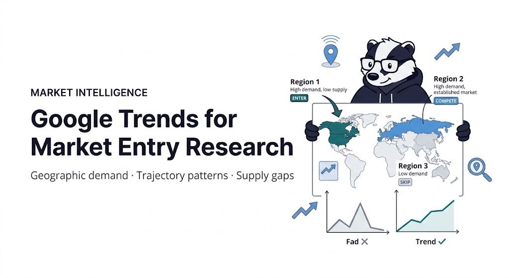
The most direct market entry application. Given a product category or search term, which geographies show the strongest relative interest — and how does that interest compare to geographies where you already operate?
Google Trends allows businesses to filter data by location and demographics, helping them identify trends that are specific to certain regions or target audiences. The "Interest by subregion" feature shows which countries, states, or cities have the highest relative search interest for a term. This answers the geographic targeting question directly: where is the demand most concentrated?
The analysis to run: enter your core product category search term, set to worldwide view over the past five years, and examine the subregion breakdown. The top 10–20 regions by relative interest score are your primary geographic demand concentration map.
Where this gets strategically useful is the gap analysis. If your product is already strong in Region A and Region B shows similar demand intensity but zero current presence, that is a prioritised expansion target. If Region C shows lower demand intensity but your competitive intelligence suggests low existing supply, the demand-to-supply gap makes it more attractive than regions with higher demand but saturated competition.
You can identify "search hotspots" with high demand but low competitor density by delving into city-level data. If an area exhibits strong search interest but poor sales there, you have discovered a distribution gap.
ScrapeBadger's Google Trends API returns this geographic interest data programmatically — enabling comparison across 50+ countries simultaneously rather than checking each geography manually. For companies evaluating multi-market expansion, the ability to generate a ranked geographic demand map across all potential markets in a single API call collapses what would otherwise be days of manual analysis into minutes.
Analysis 2: Trend Trajectory Classification
Not all rising trends are equal. A trend with a "mountain peak" pattern — sharp rise, then rapid decline — is a fad. A trend with a steady long-term upward trajectory is a structural market shift. Entering a fad at its peak produces one set of business outcomes. Entering a structural trend early produces a different set.
The trajectory classifications to distinguish:
Structural growth: Consistent upward trend over three to five years with no major reversal. The search interest line moves from lower-left to upper-right with moderate volatility. This pattern indicates growing underlying demand that is not cyclical or event-driven. Market entry in a structural growth trend captures demand that will continue to grow after entry.
Fad pattern: A sharp spike reaching a peak, followed by a return to near-zero interest within six to eighteen months. The shape is a mountain. Products that successfully capitalise on fads time their entry to the upswing and their exit before the peak — difficult to execute. Market entry decisions based on a fad pattern require an unusually short payback period.
Seasonal cyclical: Regular peaks and troughs aligned with calendar patterns — December for holiday products, June for summer goods, January for fitness. The average annual interest may be stable or growing, but operating in the trough requires different inventory and marketing planning than operating in the peak. Seasonal cyclicality is predictable and manageable; the key is entering with sufficient runway to reach the first peak cycle.
Breakout pattern: A term that was at low, stable interest for years and has recently begun a rapid sustained rise. This is the highest-value entry signal — you are identifying a trend before it reaches mainstream awareness. The breakout pattern combined with low competitive density is the best market entry signal Trends produces.
BYD overtook Tesla's EV market share in Q4 2024 and Q1 2025. The search interest trajectory comparison between the two brands over the preceding five years showed BYD's steady rise before the market share shift — a leading indicator that preceded the mainstream narrative by over a year.
Analysis 3: Geographic Demand vs. Competitor Supply Gap Analysis
The most operationally powerful Trends analysis for market entry is the intersection of two datasets: geographic demand intensity (from Trends) and geographic competitor presence (from your competitive intelligence or from ScrapeBadger's Google Maps data).
The matrix has four quadrants:
High demand, high competitor supply: Established markets with significant competition. Entry requires a differentiated offer or a cost advantage. Trends data confirms the market exists and is active; the question is whether your entry can displace incumbents.
High demand, low competitor supply: The target quadrant. Strong consumer interest with insufficient supply to satisfy it. These geographies represent the clearest market entry opportunities Trends analysis can identify. Competitor presence is low not because demand is low — the Trends data shows demand is high — but because existing players have not yet expanded there.
Low demand, high competitor supply: Declining or saturated markets. Trends interest is falling or flat; competitive intensity remains from when demand was stronger. Generally the worst market entry scenario.
Low demand, low competitor supply: Nascent or undiscovered markets. Could be early-stage opportunities or simply markets where the demand category does not resonate. Further research required before investment.
The geographic breakout analysis from Trends provides the demand side. Competitive density data from Google Maps (businesses in your category per geography), SERP analysis (how many businesses are ranking for your category keywords in each market), and direct competitive research provides the supply side.
Analysis 4: Related Queries for Entry Angle Identification
The "Related queries" section of Google Trends reveals what people who search your primary term are also searching for. In market entry context, this data answers a different question from demand intensity: what specific aspect of your category is the primary driver of interest in each geography?
A company entering the home fitness equipment market might find that "resistance bands" drives significantly different related queries in Germany versus the United States — reflecting different fitness cultural contexts, different price sensitivities, and different product familiarity levels. Entering both markets with identical positioning would be suboptimal. The related queries analysis identifies what the entry angle should be in each geography.
The "Related Queries" area reveals surging and top search terms. "Rising" searches expose new market needs. "Top" queries show established popular queries indicating stable demand.
The rising queries are the most valuable for market entry timing. A category term that is stable, combined with adjacent terms that are rapidly rising, suggests the category is evolving in a specific direction. Entering with a product positioned for the rising adjacent need rather than the stable core need may be better timing.
Reading the Trend Shapes: A Reference Guide
The visual shape of a Trends graph is the fastest way to classify what you are looking at. The specific patterns that matter for market entry decisions:
The hockey stick: A long flat baseline followed by a recent, steep, sustained rise. This is the breakout pattern described above. The key diagnostic question is whether the recent rise represents a genuine structural shift or an event-driven spike. Check whether the rise began at a specific news event or product launch. If the rise predates any identifiable event and has been sustained for three or more months, it is more likely structural.
The seasonal comb: Regular peaks at consistent calendar intervals with consistent trough depths. The peaks are your high-season months; the troughs are your inventory and marketing planning baseline. Entry timing into a seasonal category should target either immediately before the first peak (to capture maximum early revenue) or immediately after a peak (when real estate, staff, and supplier costs are at their lowest). Never enter at peak when costs and competition are highest.
The declining slope: Consistent downward movement over two or more years. Categories in secular decline require either a differentiated approach that appeals to a segment still growing within the declining category, or clear exit from consideration. Trending data cannot make a declining market better. It can confirm you should not enter.
The volatile plateau: High average interest with significant week-to-week or month-to-month swings. Volatile categories are often event-driven — technology product cycles, sports seasons, media releases. Entry requires understanding what drives the peaks and whether your product can benefit from those peaks or needs to operate in the troughs.
The slow grind: Modest but consistent interest growth of 5–15% per year over five or more years. This is often the most commercially interesting pattern because it indicates a category growing steadily enough to build a business in but not so explosively that it has attracted massive competitive entry. Many successful niche market expansions follow a slow-grind category.
The combination of pattern classification and geographic intensity mapping produces a two-dimensional entry assessment: whether the trajectory is right and whether the geographic demand concentration aligns with your expansion priorities.
The Competitor Search Share Analysis
One of the most sophisticated Trends applications for market entry research is the competitor search share comparison — entering your brand and two or three competitors into the comparison view to assess relative market mindshare.
Share of search accounts for 83% of market share, based on 30 case studies across 12 categories in seven countries. This empirical correlation makes competitor search share comparison a meaningful proxy for market share in categories where direct sales data is unavailable.
The market entry relevance: if you are entering a geography where one competitor dominates search share with 70%+ of the combined interest, you are entering a market with an established market leader who has significant mindshare. If the interest is distributed roughly evenly across three or four competitors with no clear winner, the market is still being competed for — and entry has a better chance of capturing meaningful share.
Comparing competitors allows for seeing how campaigns, product launches, or crises influence public attention. These shifts aid in assessing brand performance and guide strategic decisions over time.
For market entry specifically: a competitor's search share that peaked and is now declining — shown clearly in the time series comparison — indicates a deteriorating competitive position. Entering a geography where the incumbent's search share is falling is a more favourable entry timing than entering when they are at peak strength.
Avoiding the Most Common Trends Analysis Mistakes
Three mistakes consistently undermine Trends-based market entry analysis:
Confusing absolute interest level with relative interest. A geography showing a Trends score of 80 for your term does not necessarily mean more searches than a geography showing 40. The scores are relative within each geography. A market with a high relative score but a small total search population may represent less absolute search volume than a market with a lower relative score but a large total population. Combine Trends relative data with population and internet penetration data to estimate absolute market scale.
Treating a single keyword as the complete market signal. Consumer search for a product category is distributed across many keyword variants. "Web scraping API" and "data extraction tool" and "automated data collection" all describe the same product category but may have very different geographic distributions. A geography that scores low on your primary keyword but high on a variant may still be a strong market — your research missed it because of keyword selection, not because demand is absent.
Acting on short time windows. A keyword that has risen sharply in the last 30 days may be a breakout trend or a news-event spike that will normalise in a few weeks. Extend the time window to at least 12 months before classifying a rise as structural. Three years of data is better for major market entry decisions.
Building a Market Entry Research Workflow
The practical application combines all four analyses into a decision framework that runs systematically rather than as ad hoc manual lookups.
Step one: Define the keyword set. Market entry research requires multiple related keywords, not a single term. Your core category keyword plus three to five related terms captures the full semantic field of consumer intent. "Web scraping API" plus "data extraction tool", "competitor monitoring software", "price tracking API" — the full set shows whether interest is concentrated in one aspect of the category or distributed across multiple use cases.
Step two: Run geographic demand mapping. For each keyword in the set, pull the interest by subregion data for a five-year window. Aggregate across keywords to produce a composite geographic demand score — geographies that show high interest across multiple related terms have stronger underlying category demand than geographies that show high interest in only one term.
Step three: Apply trend trajectory classification. For your top 10 geographic markets by composite demand score, examine the time series shape. Eliminate geographies showing fad patterns. Prioritise geographies showing structural growth or breakout patterns.
Step four: Cross-reference competitor supply. For the remaining geographies after trajectory filtering, assess competitor presence. Identify the high-demand, low-supply quadrant.
Step five: Extract related query entry angles. For the markets that have survived all four filters, examine the rising related queries to identify which specific product angle leads in each geography.
The output is a ranked list of geographic entry candidates with specific entry angles for each — the kind of market intelligence that typically requires expensive research firm engagement or months of manual analysis.
ScrapeBadger's Google Trends API runs all of this programmatically. The interest over time endpoint returns historical data for any keyword and geography. The regional interest endpoint returns the subregion breakdown. The related queries endpoint returns the rising and top terms. The entire five-step workflow above can be automated and run on a schedule — monitoring market entry opportunities continuously rather than as a one-time analysis.
Combined with Google SERP data for competitive density assessment, Google News for market event context, and Google Maps data for physical competitor presence, ScrapeBadger's multi-product Google platform covers the full data stack that a market entry analysis requires.
Full documentation at docs.scrapebadger.com. Free trial at scrapebadger.com — 1,000 credits, no credit card.

Written by
Domas Sakavickas
Domas Sakavickas is the Co-founder of ScrapeBadger, building web scraping infrastructure for developers and data teams. He writes about the web data market, tool comparisons, business use cases for scraping, and what it takes to turn public web data into a competitive advantage.
Ready to get started?
Join thousands of developers using ScrapeBadger for their data needs.